Friday, 30 October 2015
Argument Scene Techniques
Our group has been doing some research into how best to make our fight/argument scene between our actors look most effective as well as thinking of other things such as which shots will suite what part of an argument best. This article and video from No Film School has helped in thinking about these ideas and what will make our argument/fight scene of our music video stick out and make it look better and more meaningful than what you normally see in a music video.
http://nofilmschool.com/2014/05/tips-shoot-killer-fight-scene
Friday, 16 October 2015
Practice Shots
Here a some of the practise shots that our group took when using the tithe barn. We did this so that we could work how best to use the space in the tithe barn and also to work out how we can make it look most effective for when we film our music video. Along with this we also trialled and looked at the different options we have when it comes using make up on the actors and how best we should make it stand out and what visual look does this give to the audience.


Thursday, 15 October 2015
Pre Visualisation
Here is our groups Pre Visualisation which is used to give a layout of where and what the camera and actors are going to be. The first pre visualisation is of the tithe barn which is where we will filming our actor making it look likes he is in a confined space and that his emotions are playing on him by constantly seeing his reflection in mirrors that are showing him with different facial and physical expressions. In the second pre visualisation which has been done on Anna's kitchen it is going to be used to show and re live unwanted memories that our main actor is having.
Wednesday, 14 October 2015
Planning For Music Video
Here is our video of our group discusiing ideas that can be used for our music video when we making it. Some of the things that we think about was the digipack cover, what make up is going to be used and how certain parts of the music video will look.
Tuesday, 13 October 2015
Wretch 32 Magazine Advert Analysis
Here is my magazine analysis that Wretch 32 used to promote his tour and new album Wretchrospective which he released in 2008.
Monday, 12 October 2015
Example Magazine Advert Analysis
Here is my magazine advert analysis of Example's tour advert that was used in magazines to promote concerts that he had during his tour in 2012.
 From looking at the top of the poster we can see a close up of the body with his face being split in half into black and white but the background that is surrounding his face is then the opposite side to the sides which at first had black and white on.
Below this you can see the name of the artist being shown in a bold font without the use of capitals. This is surrounded by a yellow text box around the outside.
Next to this it has in a smaller font the name of special guests such as Wretch 32 which will appear as acts on his tour. This for some fans will be a selling point to go and watch them performing.
Following on from this we see the dates of which Example is performing on as well as what the location is and a phone number which can be used at all of these venues to purchase tickets to his concerts directly through them.
Below this we see the surrounded in a bold red box is added date of an extra concert being put on. This can be used to show the audience how popular he is and that the demand is so high that there is another chance to be able to watch him perform.
At the very bottom of the magazine advert is the extra information and links to websites such as Ticketmaster which are different places for fans and customers to be able to purchase tickets from. It also shows when his new album is going to be released. By putting this type of information on the bottom of the poster it allows for fans who enjoy his concerts to know when they can purchase their own copies of his music.
Friday, 9 October 2015
Audience Research
Here is our groups filmed audience research. We ask a variety of questions relating to to what genre of music they like, what is their favourite genre of music, how they listen to and download music.We also got them to look at a part of the music video Breezeblocks by Alt J and then asked them about what they thought was good about using a slow motion effect as well as showing the audience what has happened at the start instead of making them watch the video as the storyline gradually reveals what is going on. This is because it is a concept that we are considering using in our music video and we wanted to know if audience members like the idea of it.


Timelapse Storyboard
This is the beginning of our storyboarding being drawn by Anna. She is drawing the opening shots, which show the initial signs of our unstable actor starting to question himself mentally before starting to think of flashbacks in his conscience. Other information that will be put onto the storyboards are what shot number this is, what is the shot type, a little description of what is going in the shot and also what lyrics will the audience hear whilst they are watching the music video.
Thursday, 8 October 2015
Mood Board
Here is our groups mood board. We have made this to show the type of emotion and look that we want to be able to create within our own music video.


Wednesday, 7 October 2015
Maroon 5 Magazine Advert Analysis
Here is my analysis of the magazine advert that Maroon 5 used to promote their tour in 2011. In this case the magazine advert has been personalised just to be used for Manilla.


- At the top of the magazine advert you can see the name of the band being written in a thin and bold font with all of it being done in capitals. This can be used make the advert standout more to the public who look at it.
- The letter M has been split into a top half and a bottom half. With the bottom half of the word being made into a V in the colour red and the top half of the M being left the same. This may have been a theme that was used throughout the tour as well as also being a symbol to the type of music that they are creating.
- The use of having the letter V in red is used again within the word live shows it prepatition as well as it confirming that there is a deeper meaning to it.
- In the middle of advert we see a close up of all of the band members. This is one of the ways in which the band can be recognised globally due to people knowing who the band members are especially with the likes of Adam Levine in the band.
- Below this information is given such as what day the concert is happening, what time it starts and what the location is. Yet again the letter V is in the colour red.
- At the bottom of the poster the phone number of where tickets can be purchased from is shown. This can be used by fans in order for them to be able to purchase tickets to go to concerts such as this one.
- On the left at the bottom of the image it shows the logo of the album, which is a good feature to put on the poster so that fans/customers who like the concert then know where they can buy the album from.
- As well as this at the very bottom of the photo the bands website and twitter account have been put on the poster. By having this information of there it makes it easy and accesable for fans to get in touch with the band as well as finding exclusive news and information about the band.
- The way in which the band make the advert look with it all mainly being in black can be used to represent what type of music they may have produced and show the type of look that they are going for.
Tuesday, 6 October 2015
Scouting For Girls CD Cover Analysis
Here is my cd cover analysis of Scouting For Girls album Every Body Wants To Be On TV. It was the second album that the band made and was released in 2010. The album has a more retro style looking look through some of the objects which have been used to make up the front cover of the album.
Monday, 5 October 2015
Mumford & Sons CD Cover Analysis
Here is my analysis of the cd cover Sigh No More by Mumford & Sons. The album was released in 2009 and has been one of the bands most popular albums.


- The style that Mumford & Sons have gone for is the band members being filmed in a long shot with them being the shop window display. The general look of this is that it naturally blends in and the band members don't look out of place.
- The name of the band and the name of the album have been left down the bottom of the the picture. This is so that it doesn't disturb and interupt the look and concept that the band have tried to capture with the album cover. By disguising it to belnd in wih the pavement it also makes the words like like they are jumping out at you.
- The general look and what clothes the band members are wearing represent and give a hint to the audience about the type of music the band performs as well as the style/look that they are going for as well.
- The back of the cd cover is muc simpler, at the top of the shot we see the barcode that is used by shops to scan the item before it is bought. You can also see the window of what would be the back of this house/building.
- Below this you can also see the names of the songs which the band have got on this cd.
- Following this at the bottom of the cd it has the names of record labels as well as recognition for other artisits and muscians that feature on the cd.
- On the sleeve of the cd you can see the name of the band as well as the record label as well. It also shows the name of the album as well.
Research - Jack Garratt
For the secondary reaserch I have been looking at Jack Garratt and at how popular he is as an artisit through music streaming and downloading sites as well as social media. He is regarded as an up and was discovered through the use of Radio 1 introducing and last year was able to perform at Reading and Leeds Festival. Here is some of the ways in which he presents himselfs and also show that amount of followers, views and subscribers he has for,Youtube, Spotify,Itunes,Twitter,Facebook and Soundcloud.
Friday, 2 October 2015
The Kooks CD Cover Analysis
Here is my CD cover analysis of the of the album 'Konk' by The Kooks. It was released in 2008 and was there second album that they released.
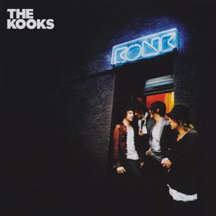
- The name of the band is in a small but strong and bold font in the top left of the album. It has been kept to the side of the album mainly so that it doesn't interfere with the look of the album. It hsas also been put there so that it is easy to work out who's album it is and what band sings it. By having all of the letters as captials it can be also used to show its importnace as well.
- The general look of the album cover has the band mates across to the right of the photo mainly in the doorway of what could pressumed to be either a club/social place. There is minimal light coming through from the back of the shot.
- The name of the album 'Konk' has been placed above the band in an old style with neon lights but naturally blends in with the rest of the photo and looks very smart. The name of the album also has a meaning to the band as it is where they actually recorded the album. By using this for the name of the album it has now become a place for fans of the band to make a connection with them.
- The band members which are being shown in a mid shot to right aren't looking at the camera. This could be because they're focusing on something different or that they are trying to create the opinion and persona of a stylish band that has its own natural look. By having this as well you could also suggest that the band members are all pretty equal and there isn't one of that needs to stand out more to sell the album.
- By having the brick wall in the background and the dark colours surrounding the band members it makes them stand out more and brings them to the full front of the album cover.
- The general clothes that they are wearing represent the genre and style of indie music and look that the band go for. By showing this it will attact fans/audience members who like the genre of music and look that they have.
Bastille CD Cover Analysis
Here is my CD cover analysis of the album 'Bad Blood' by Bastille. The album was released in 2013 and has been one of Bastille's biggest successes.


- At the very top of the album cover we can see in a small font that there is the name of 'Bad Steel', this doesn't actually have a direct connection apart from sounding of a similar pronounciation of the band name. Its has probably been added in as either part of sponsorship deal or just becuase the band like to have a play on on their album covers.
- Following this we have the name of the band 'Bastille' which has been used in a clear font and near the top of the album cover so that it is easy to find and is recognisable when you go to look for and buy the album.
- After this we see a long shot of a man running away from a car with the headlights shining on him. He is the centre of the photo, with this idea maybe also relating to the name of the album which could be a common theme that might have been used in music videos that have been made.
- Next we see the name of the album 'Bad Blood', which again is in the same font as the name of the band and also has the lette A repleaced with a triangle. This could also be a potential idea that and deliberate act that the band has done. There is also a very small picture of again of a triangle seperate to this which isn't in a word.
- At the bottom of the advert we have the names of production companies and the various record labels that Bastille work with, who will want their names to be mentioned so that they can prmote their businesses as well for potential customers that they can reciece from people purchasing this album.
- This is an unconventional looking poster as it doesn't give any indications about the genre of the music or tell you anything about the tone of the music. If anything it looks like it could be used for a film as a cover to that.
Paolo Nutini CD Cover Analysis
Here is my analysis of the CD cover by Paulo Nutini for his album these streets. The album itself was released in 2006 and was one of Nutini's most succseful and earliest albums that he recorded.

- The album cover is made up of four long shots each of which show Nutini with a different pose being done in each one. The use of the colours and each different shot that he shows may have a deeper meaning to why which colour went with which shot.
- His name is at the top of the album as it will be one of the most recognisable features if you don't actually know what he looks like. Another reason for this being at the top will be is that when people look and are looking through physical copies of CDs they only browse and look at the top of the album cover.
- The name of the album 'these streets' has been kept very informal and is just below the name of the artist. This wouldn't be as recognisable as the artists name so it is kep very informal and which is also why there are no capitals within in the name of the album.
- Visually by being able to see a guitar in the album cover you can naturally assume that the majority of his music and songs on the album will involve a guitar being used.
- The colours that he has used on the CD cover all have and represent different meanings such as white representing goodness and simplicity, yellow representing joy and energy, orange representing youthfullness and wealth and red representing love and anger. These colour representations all show and represent his music as well.
- The album cover has been kept very simple and isn't over advertised or made to look out of place.
Audience Research Questionnaire
We have created a questionnaire that is going to be sent out in order to get some intial feedback and give our group some ideas to think about when we are planning to and filming our music video.
Some of the questions that we used when finding out this information were:
- How often do you watch videos?
- What music genres do you listen to?
- Favourtie artist?
- Do you prefer narrative or performance style music videos?
- How do you purchase music... Itunes,Spotify,Physical copy, piracted?
Coldplay Magazine Advert Analysis
Here is my analysis of the magazine advert that coldplay put in magazines and used on their tour for the album Mylo Xyloto.
Thursday, 1 October 2015
Bastille Magazine Advert Analysis
Here is my analysis of the Bastille tour poster that has been used in magazines to inform fans and customers of when they are playing, how you can purchase tickets and social media accounts which the band have.
Someone New Music Video Analysis - Hozier
Here is my analysis of the music video Someone New by Hozier. I chose to analyse this music video because it shows narrative and performance aspects to it as well as the lyrics connecting and playing a very influential part to the music video itself.
Subscribe to:
Comments (Atom)